UX Research
Case Study
Medical Thinking Systems

An online infotainment platform – Namaste Switzerland has been designed to address the needs of the expat community living in Switzerland and the Swiss locals interested in knowing more about the diverse lifestyles of the foreign residents within the country.
Today Namaste Switzerland is a content-first platform, where we deliver immersive multimedia content in the form of a new issue every month. We’ve reached almost a million viewers in a short span of four years. And our relevance today has been reiterated by loyal and new readers, as well as our writers and contributors alike.
Client
Namaste Switzerland, Baden/Zurich
Website
https://namasteswitzerland.ch
Software Name
Namaste Switzerland
Role
Co-founder, UX researcher, designer and developer, Product Owner, Design Lead
Team size
Four (4) – one researcher/designer, two journalists and one marketer
Timeline
September 2016 – Present, part-time and on a requirement basis
UX Activities
- UX Research
- UX design and redesign
- Quantitative research – Surveys
- Workshop moderation
- Information Architecture
Tools Used
- Adobe Creative Suite
- Figma
- Miro
- WordPress
- Google Analytics
- Hootsuite
The Problem
This website started very small and within a few months, we started receiving more content to be published than expected. In a couple of years, the number of blogs almost exploded to over 300 in number and the website started to look chaotic with extremely long menu items and disjointed content.
In three years, we realized our audience type had changed and that the website needed to suit the needs of our new and old audience. We had to find out what the readers wanted. We needed to design a new Information Architecture.
With the introduction of the young reader’s section – Young Voices, we started receiving double the number of articles every month. I was in desperate need of support. After a year of Young Voices, we felt like that this section was not getting the attention it deserves, and the essence of our main website was getting diluted.
Project Goals
The goals of this project were and are manyfold. Some of them are as below.
- To create a platform that makes accessing information very easy.
- The platform must be scalable and should be able to accommodate a large variety of topics without significantly affecting its information architecture and navigation.
- The website should feel welcoming and encourage contributors to write for us.
- Businesses should be able to connect with us for collaborations.
The Research
I performed various types of researches for different needs across the years. A few of them are mentioned below.
Quantitative Analysis – Online Survey
To gauge interests and to judge future business ideas, we came up with a few questions and ran a quick online survey on our website. A couple of synthesized data are below.
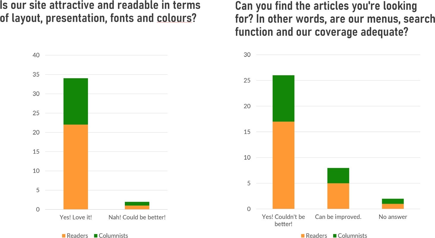
Results of the mini-survey to check for aesthetics and usability
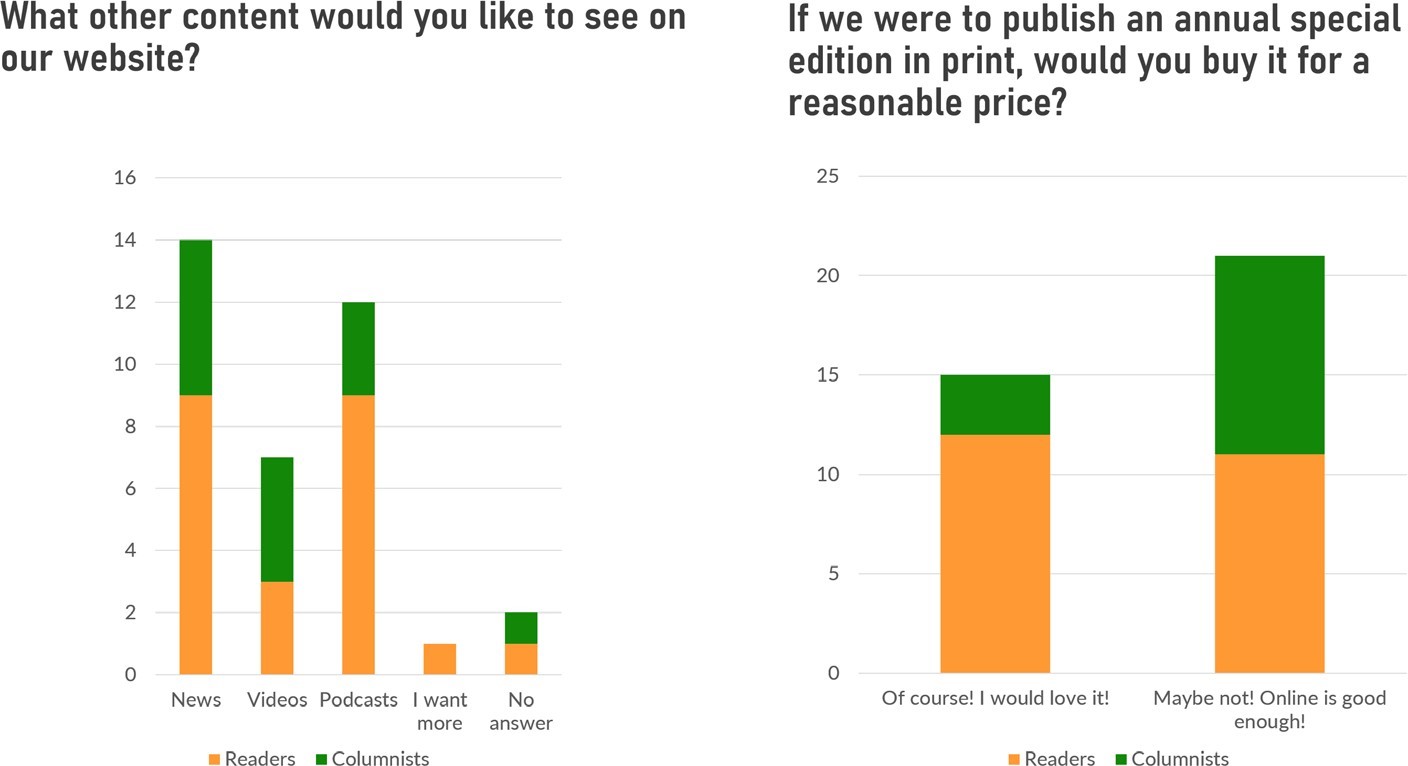
Results of the mini-survey to understand the users’ wants
Synthesis Workshop
I moderated a workshop with our 20+ contributors and collected ideas from them on how we could take this platform to the next level.
After that, I moderated another workshop with the co-founders, and together we came up with some strategies to make our website more usable, useful and generate more income. As the ideas were many, I proposed we come up with a priority matrix that could help us channel our efforts better.
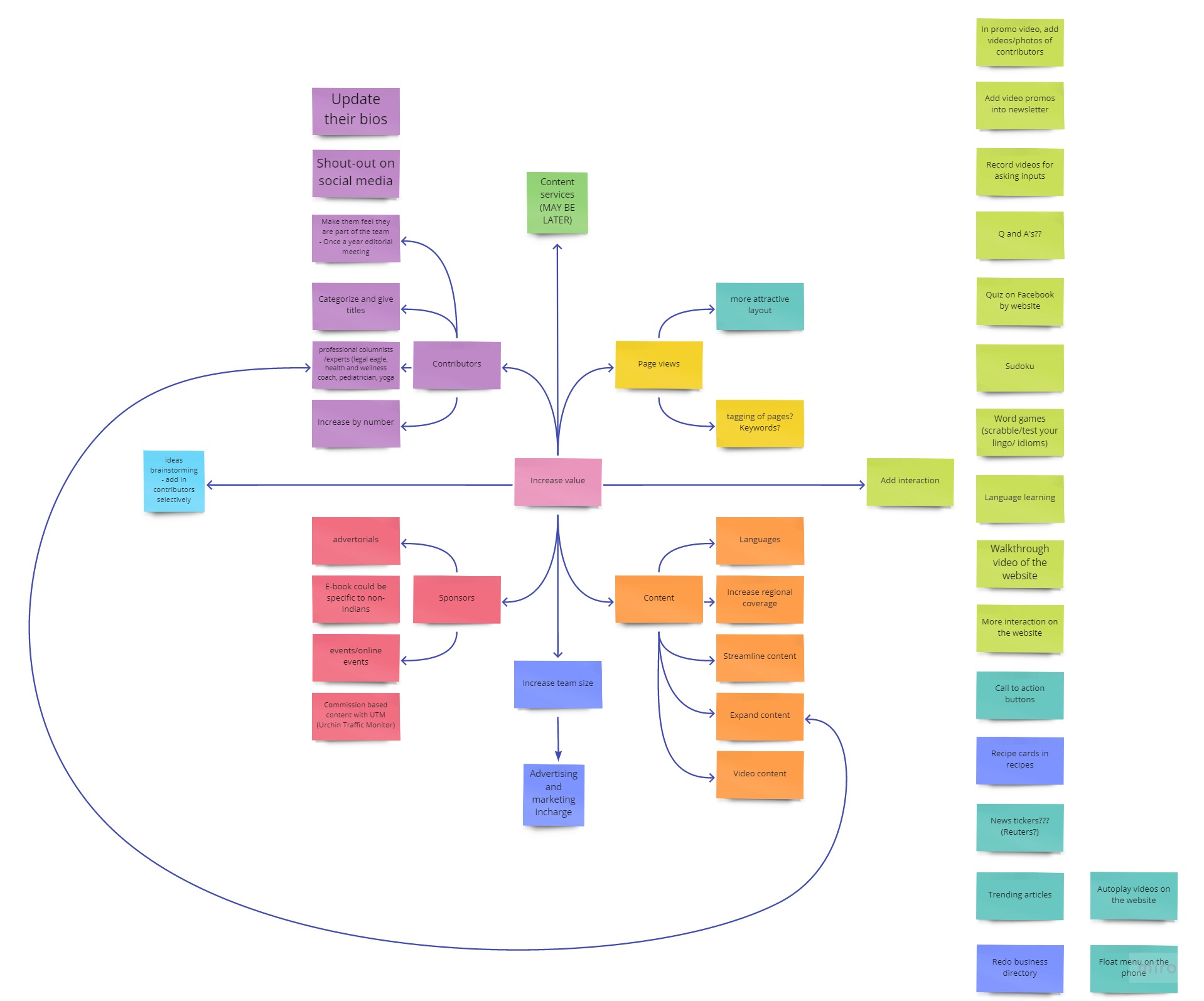
Map of different ideas and how they relate to each other
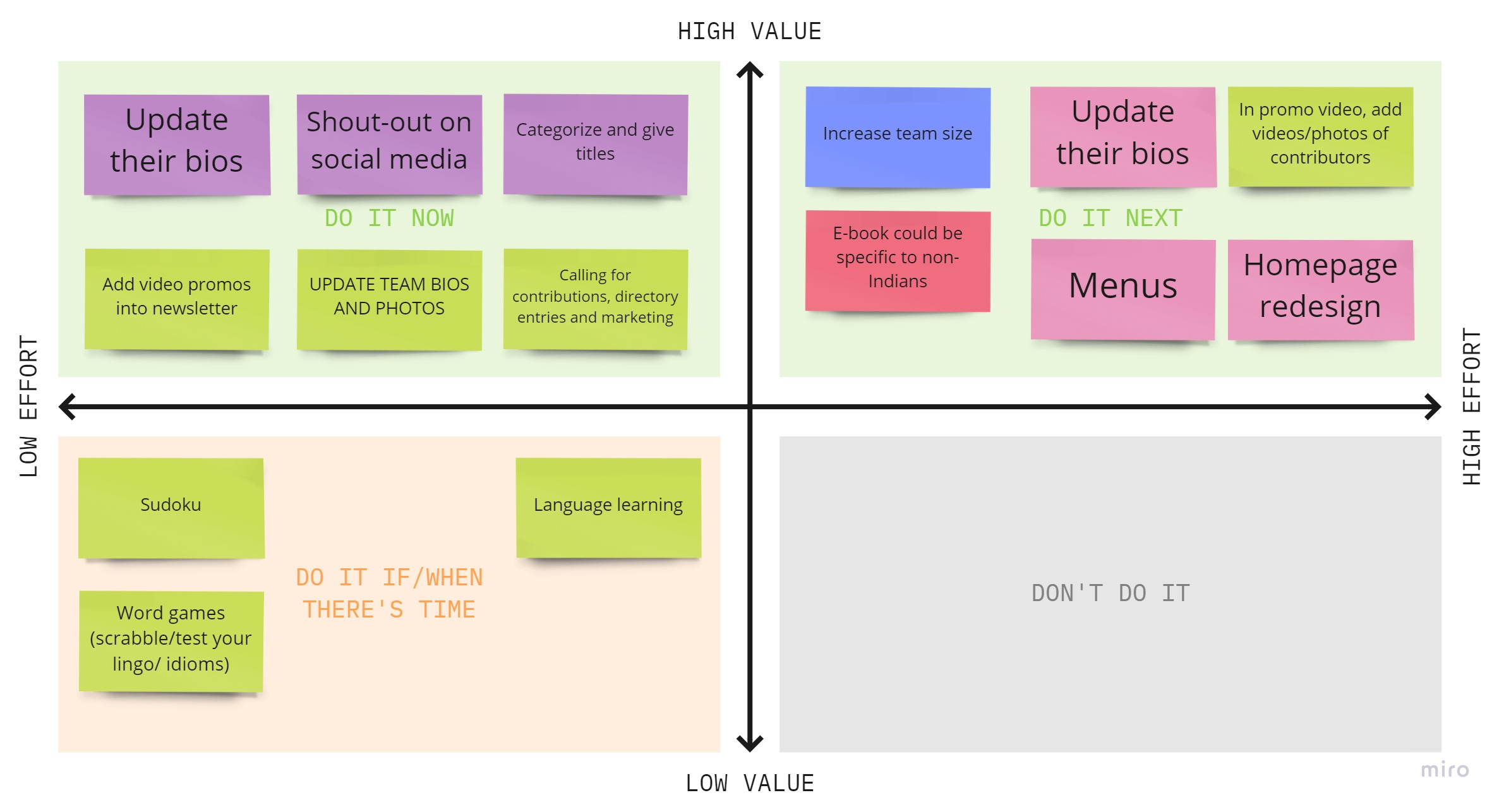
Priority matrix of the tasks
Information Architecture
Key Information Architecture tasks include identifying common features in content, forming groups of similar information objects, and linking documents to other documents on the same topic.
This concept plays a vital role in platforms like ours, where content is the focus. With more than 600 blog posts and around 700 pages which increase each month, I had to plan the contents and structure the website so that it is scalable to accommodate as many types of articles as we receive.
The first IA worked well for about two years, after which the website started to become chaotic. I then worked with the co-founders and completely redesigned the website, navigation, and back-end structure.
The front end output is illustrated below. The back-end restructuring is not illustrated and took quite a bit of work to get the desired results.
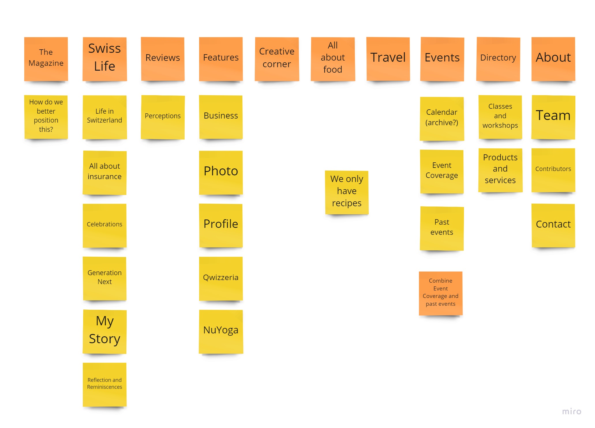
Old Menu Items
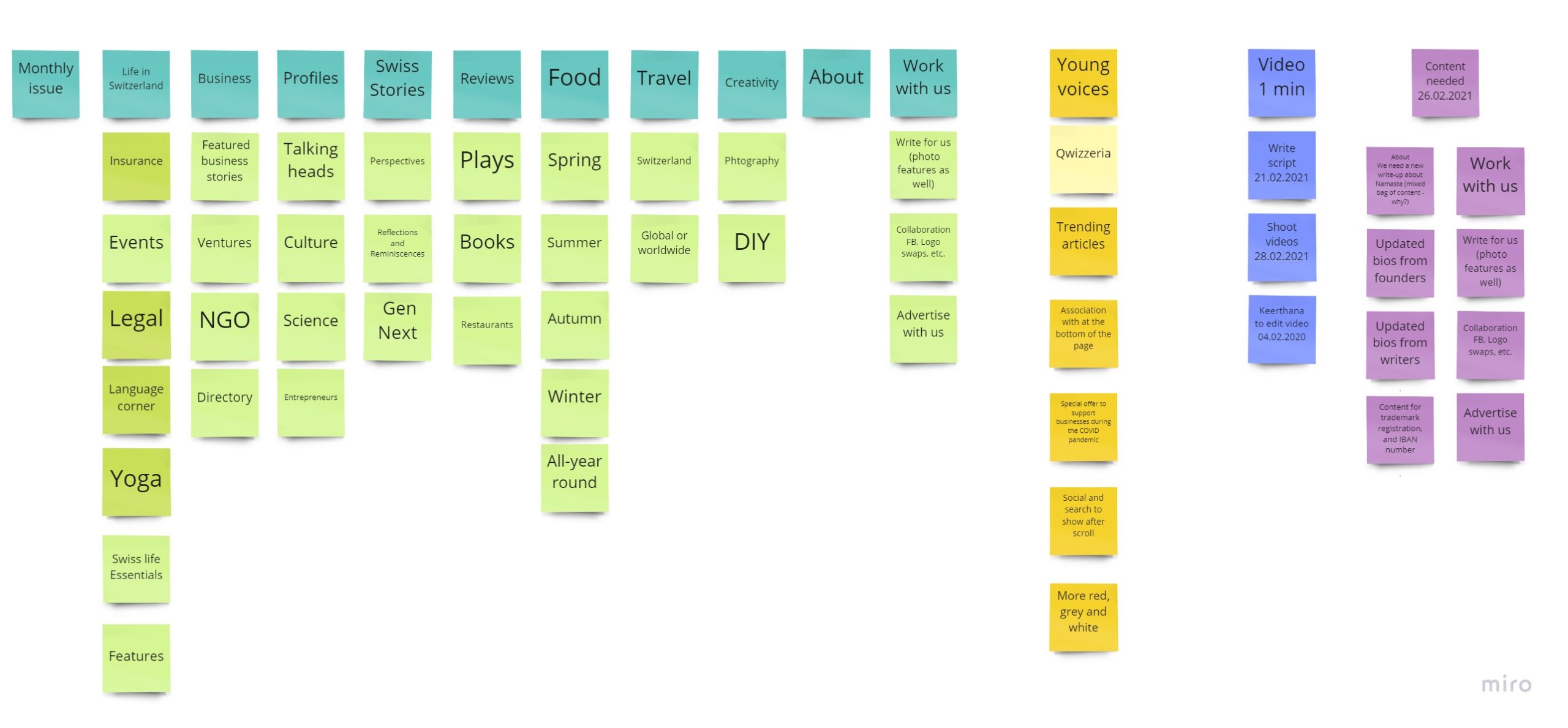
Current Menu Items
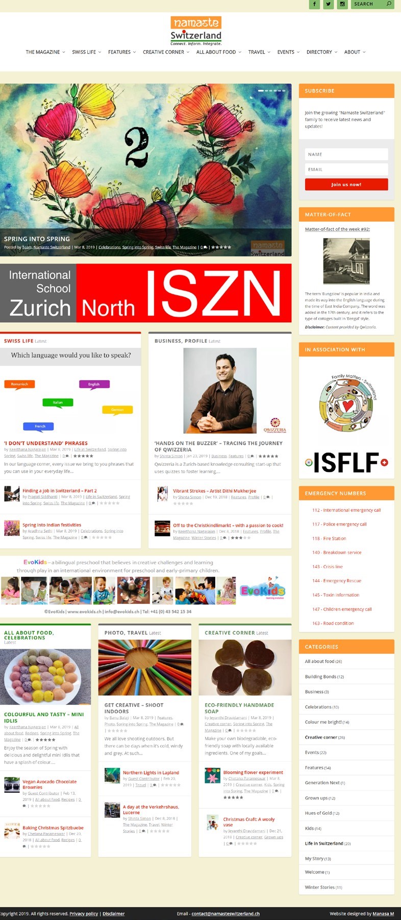
Old Website Design
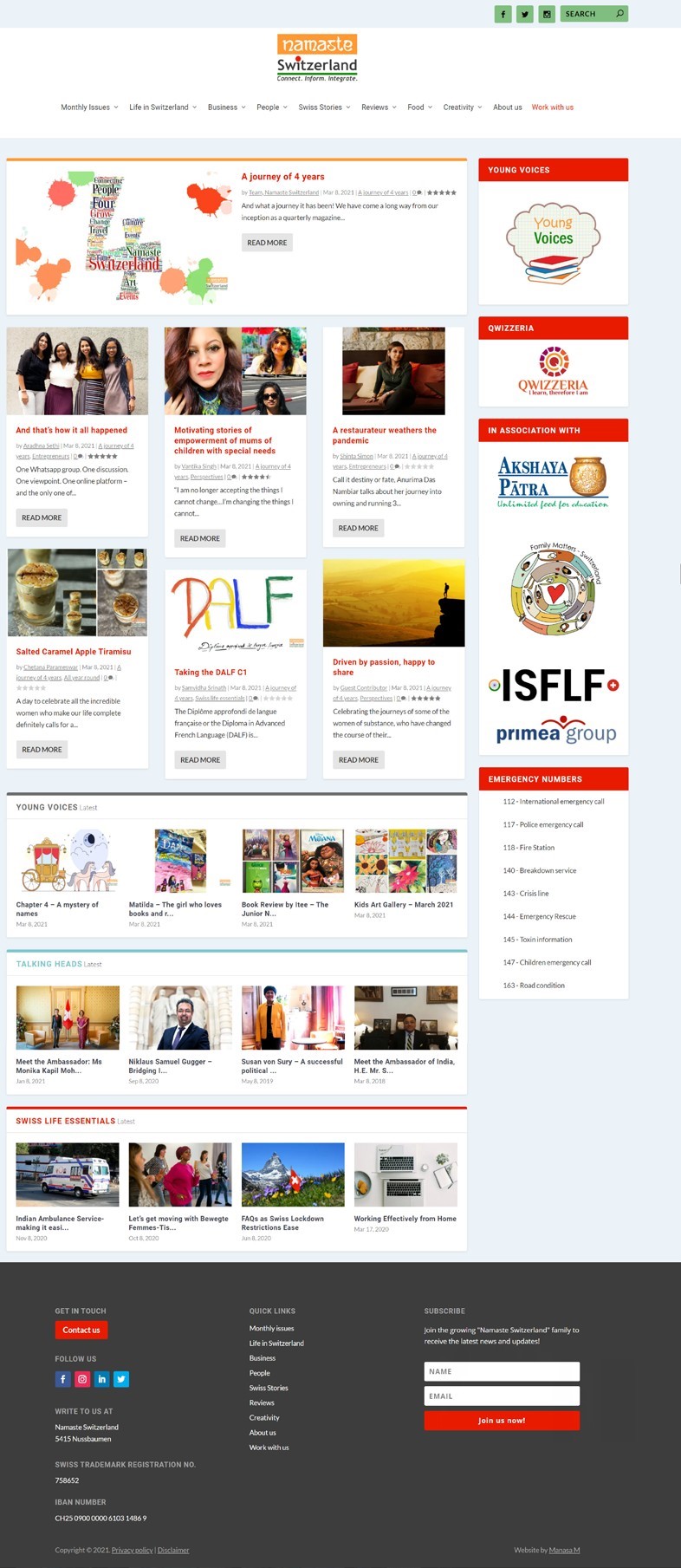
Current Website Design
Learnings
- As a co-founder, this project is extremely close to my heart and I have put in a lot of time and effort in this project, and I learnt that consistency pays! We have been publishing an issue on the 8th of every single month since March 2017. Today, we are a team of 30+ members and each of us are extremely passionate about what we do.
- Approaching people to ask for business was something that did not come naturally to me. However, I learnt to cold call, negotiate and bring business to the platform.
- I learnt that people can work just for their passion. All our contributors work pro-bono, and I have two people in my IT team who do the uploads every month.
- Taking a step back after setting up the platform was not easy. I learnt to let go and let the team handle the primary load of the work each month.
- It is not always easy to review work before the releases, especially during time crunches. There have been a couple of situations where I felt like it could be faster if I did the work myself. But instead, I provide feedback and let the team correct their mistakes. I learnt that this was important both for the team and myself. Now, there are very few times when I have to suggest changes.